Support Page Redesign
Background
As the leading camera and printer brand, we know that one of the best ways to stand out and leave competitors behind is by providing an excellent Customer Support Experience (CSE). For the past few months, our design team have been working towards more delightful online CSE and also mitigate call centre costs.
Problem
The average handle time of one customer is 14 mins and 70% of the case was having trouble direct on our support page and failed to find the information they need. And in the meantime, the call centre team is facing a 25% capacity reduction. So our mission is to investigate our current support page and provide an effortless customer experience online when they landing on the support page.
Process
Investigate Current page flow and design
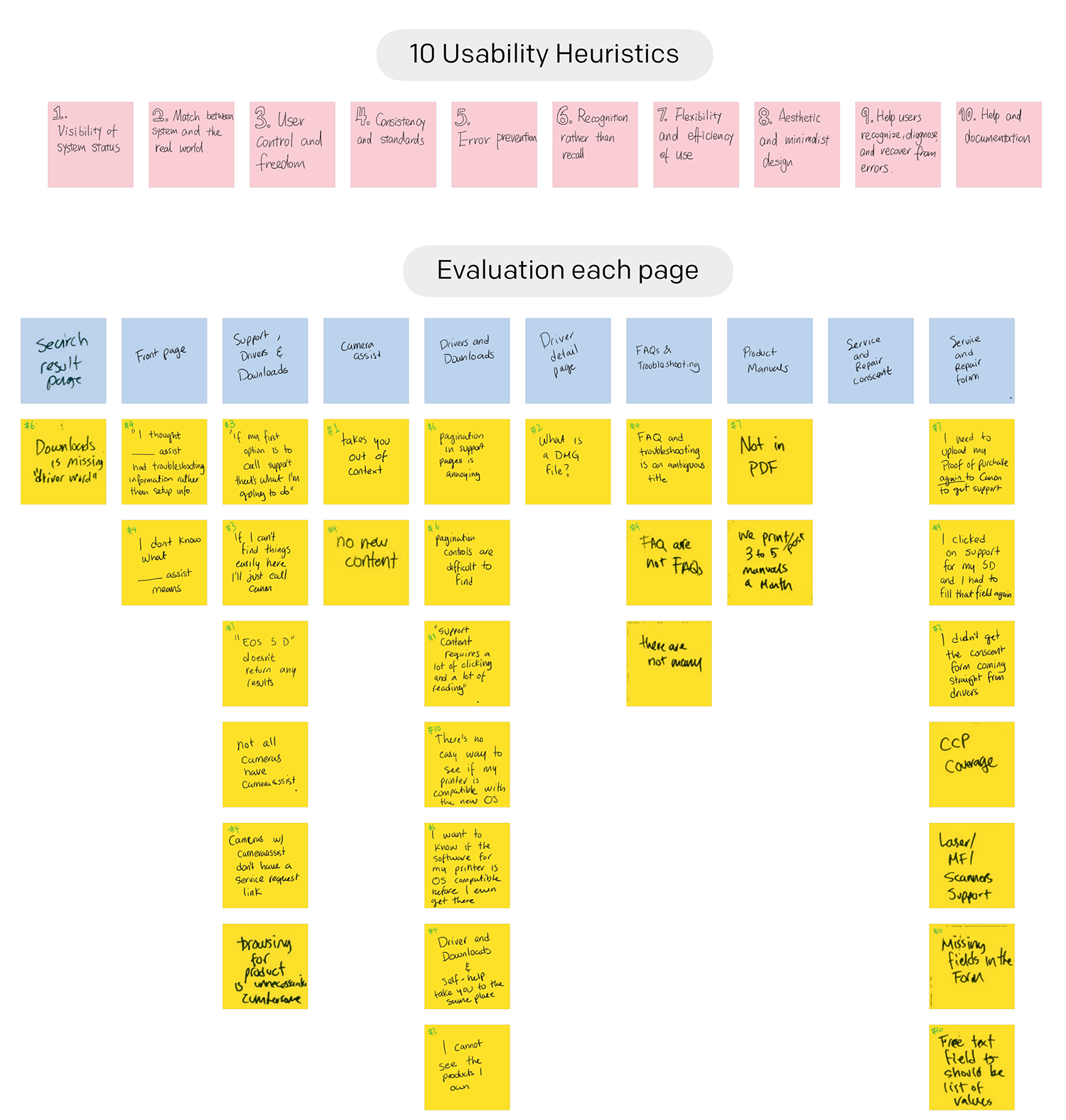
I list all the feedback from customer and SEMs on the stick post and post it on the wall and we find out the most frequently mentioned pain point is the “Consistency and standards”. Some quotes like “I thought camera assist had troubleshooting information”, “Downloads is missing ‘Diver’ word”, “‘Diver and download’, and ‘Self-help’ take you to the same place”.
Design Challenge & Paper Prototype
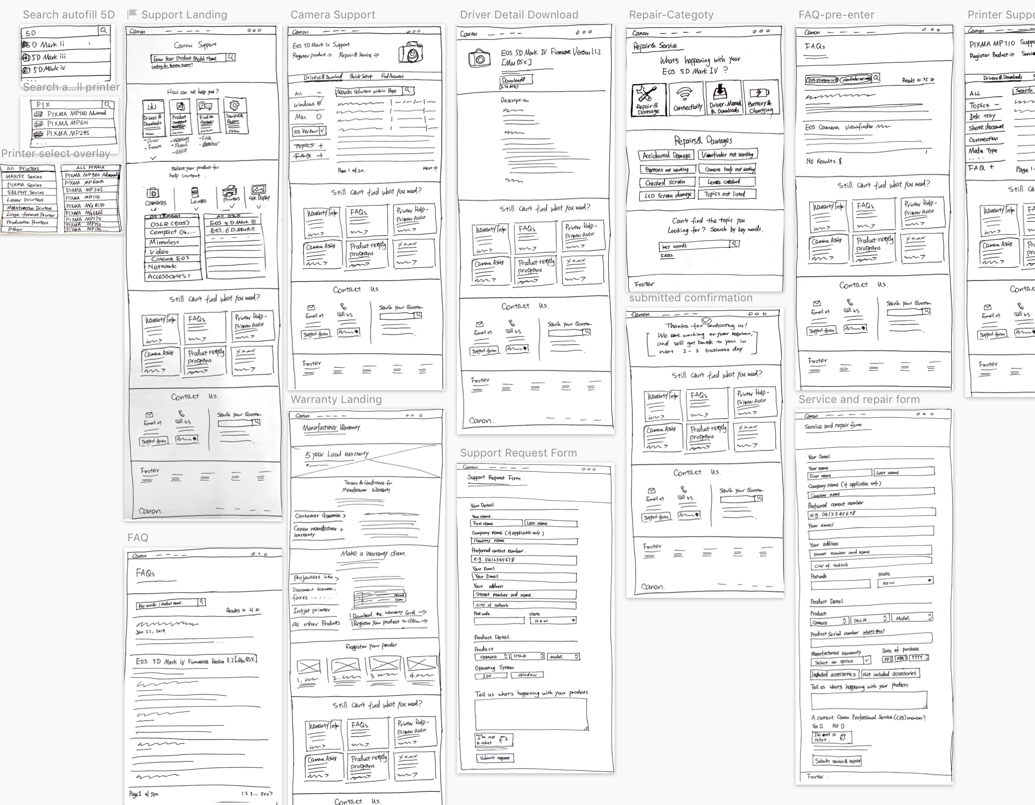
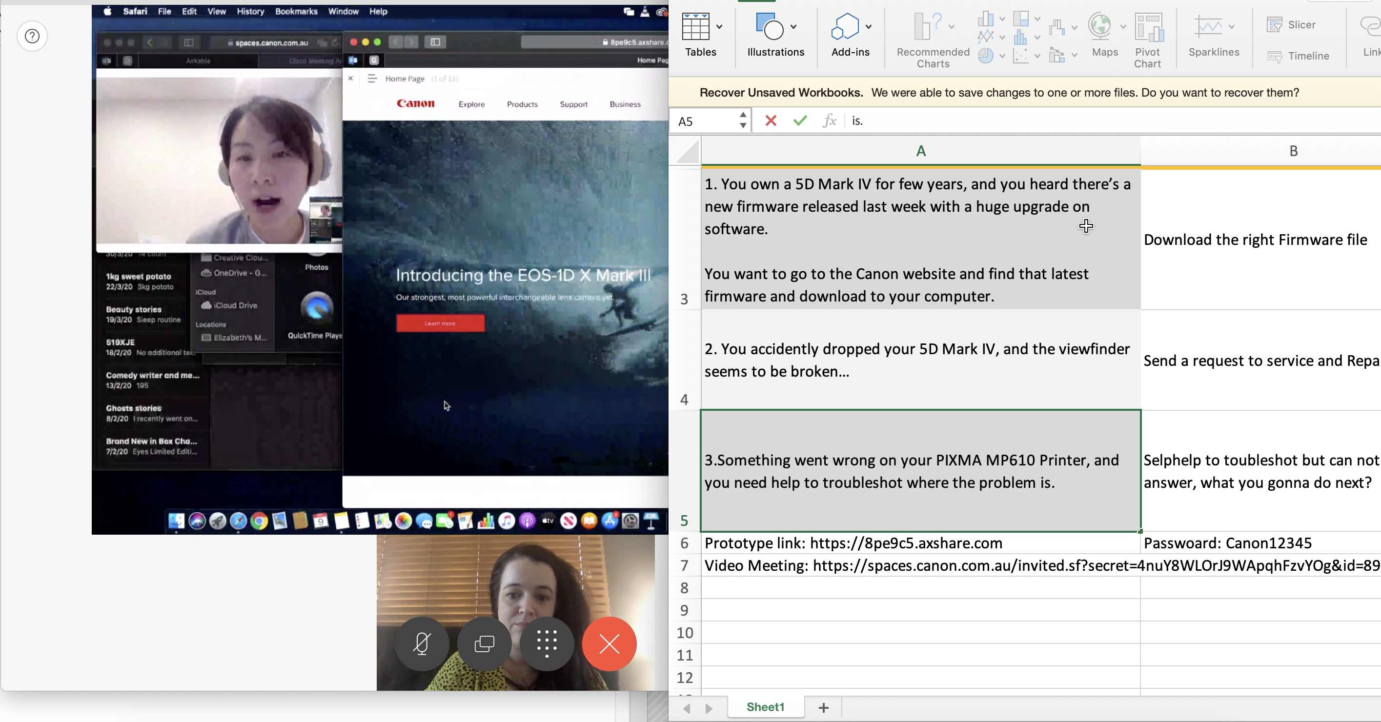
We break down all the problems with our team and conduct a design challenge workshop to see how everyone in the team solve these problems using design. And after everyone presents their ideas and designs we vote to the best practice option on each pinpoint. I gathered all these ideas and sketches and produce a paper prototype, and then run five usability test outside the team to test if it solves the problems.
Test on Screen
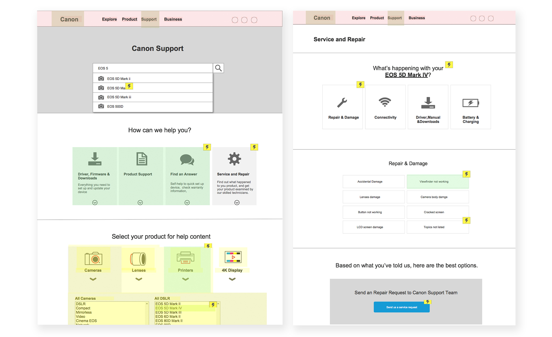
Then keep refine the user flow and the logic of the prototype design, we decide to make an interactive prototype using Axure and conduct five usability tests with our potential customers.
Usability Tests
I managed and conducted all the five usability test. This usability test was conducted as an unmoderated “think aloud” usability test via Askable. In an unmoderated usability test, users are not observed live while they carry out tasks. Instead, their interactions with the website and their verbal comments are videos recorded for later analysis.
Five users each carried out 3 tasks on the website in separate usability test sessions. At the end of each usability test session, they answered a number of pre-defined questions.
By doing that, I have identified some positive and negative feedback from the user and also some unexpected user journey while they using the prototype.
Main Finding Summarize
- Improvement Areas:
1. Users hard to manage the difference between menu items under “Support”.
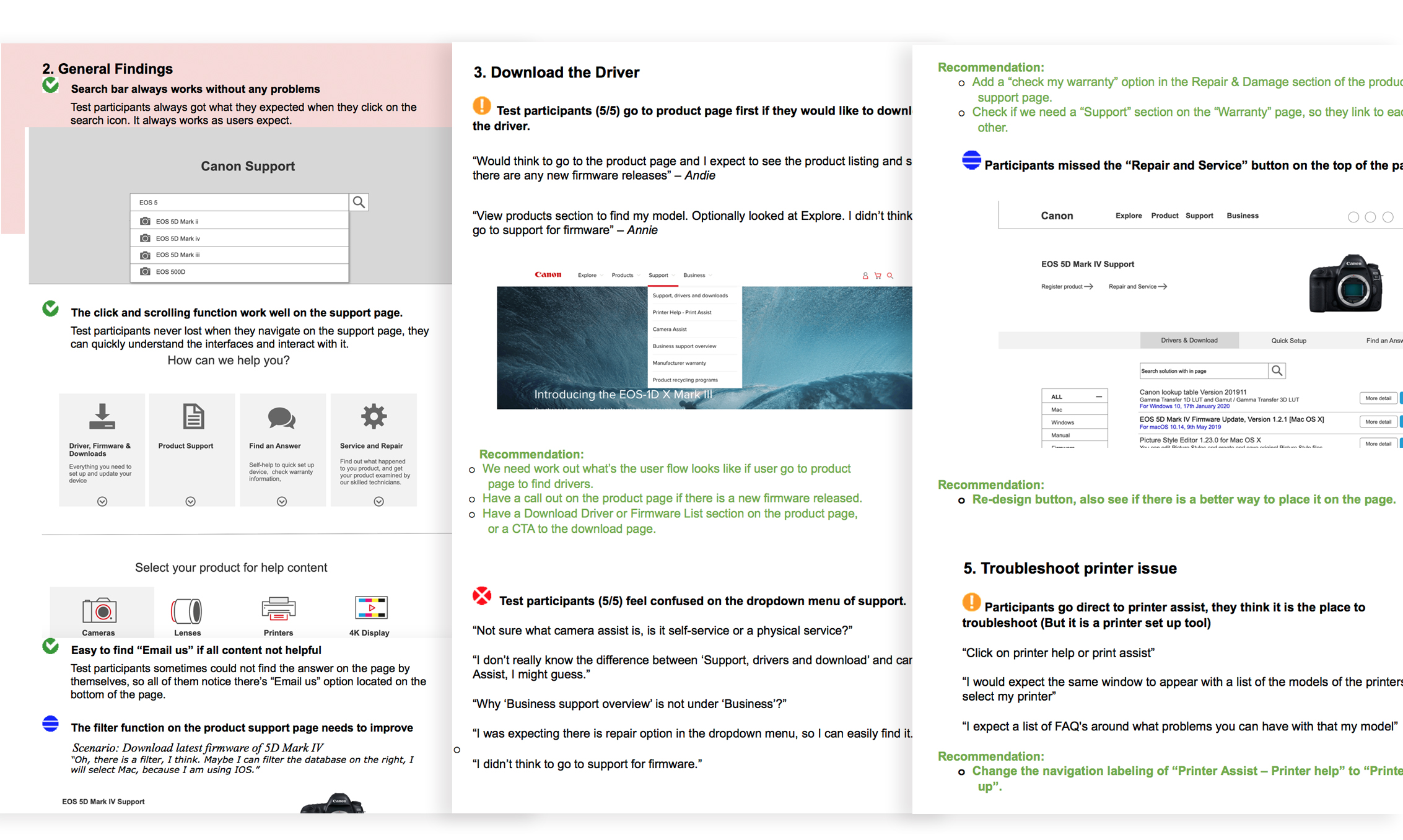
All 5 participants had similar issues on the labelling of the drop-down menu items. User is not sure what “xx Assist” really means, which creates confusion to them on their first interaction on the page. We need to create clear distinctions between each menu labelling under “Support”.
2. Users go to the Product page to find a particular product to find downloads, not click through the Support menu.
4 out of 5 participants go to the product page to download drivers for that particular product. We need to look at this user flow and add a download driver section on the product page.
- Positive Findings
1. Test participants easily realized they can search product name to find an answer on the support landing page.
2. Participants can easily understand each page and section meaning when they are doing the tasks, meaningful icons also help the user understand how to navigate and find the answer.
Next Steps
We will build from the wireframes and data research. Design and iterate on those improvement areas with Sketch to find a beautiful solution that met SME and UX/design requirements for the pages.
No Comments
Comments are closed.