Onboarding experience for KUA coffee
Bugisu Coffee (now Kua) had humble beginnings as a university project and a trip to Uganda saw the opportunity to create a circular economy; give back to communities there and bring great coffee to Sydney workplaces. Since then, they’ve begun serving over 50 Sydney offices with coffee that does the planet and its people good.
I worked with them to uncover the needs of their target user and redesign the onboarding experience on their website to solve the problem that the user faced right now.

Project Background
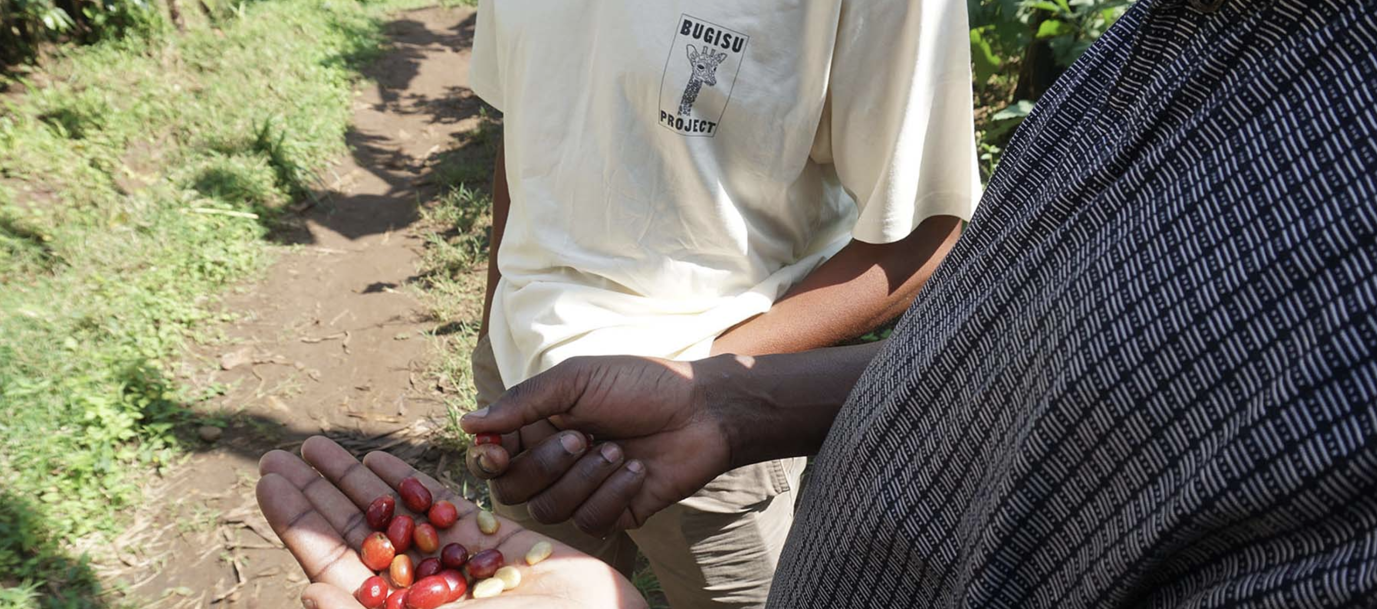
Bugisu Project is a sustainable and non-profit coffee start-up, who bring coffee beans from Uganda and supply it to the workplace in Sydney. 100% of the profits fund development in Uganda and all coffee waste will be collected and repurposed to create environment-friendly products. Bugisu team are so passionate about their beans and service, at the moment they delivered to a number of businesses in Sydney including Canva.
Project Planning
After the first client meeting, I made this project blueprints, to make sure our team is on the right track in each development stage and able to deliver the scope of work on time.

Usability Test ( Attitudinal )
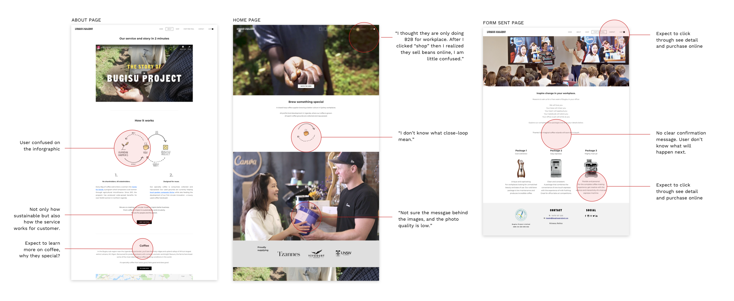
We started to evaluate the current website and talk to the user to help us understand the issue on the website. We start with 8 usability tests. Our goal is to see how user using the website by the giving task, which is “Learn what service they offer”.
Click to view detail:
Google Analytics ( Behavioural )
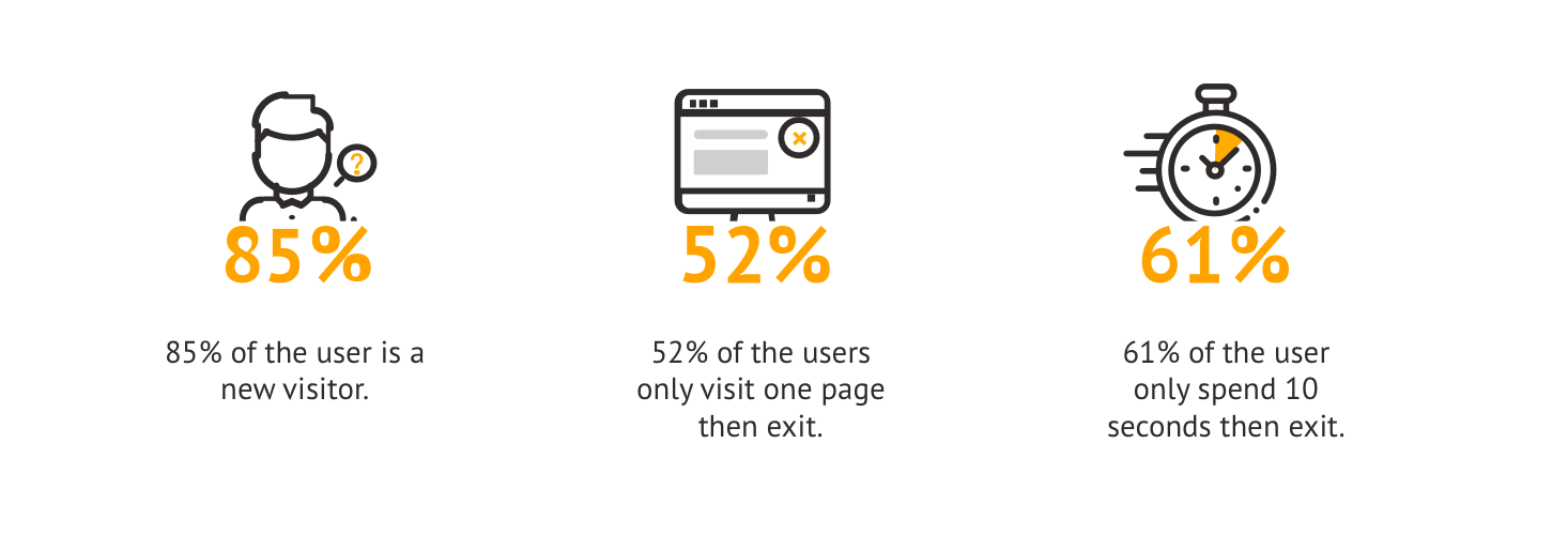
To evaluate how the user actually using the website. We had a chance to look at their Google Analytics data for the past year. And there are some related data we paid attention:
What we learned – User needs a simple intro on the landing page so they could know who is Bugisu Project and what Bugisu do. That may also encourage the user to visit more pages. We would like to know why the user exists and didn’t go deep on the website. Consider the usability results, we assume it may because the user couldn’t find the relevant content they looking for.
SEM Interview
I went to the Bugisu Project office and organise the SME interviews with three team members.
What we learned:
- Bugisu thinks their target customer is a culture manager in Startup, who cares about employees engagement and positive impact.
- Bugisu would like to change the current sales model, so the customer could learn everything online and then purchase.
- Explain the delivery process every time is a pain for the team, and customers still not clear.
Customer Survey
A survey created for current customers which ask them how they use the website and what information they looking for when they browsing. There are 9 responses from the survey (there are 10 in total).
- User visit website to learn coffee (29%), impact (29%), and service (29%).
- User wants to know how much impact they could make with Bugisu.
- Some user mentioned corporate log-in, so they able to track order history, and order online.
Contextual Inquiry

We obtained the delivery process looked at how the delivery process worked. Key takeaways:
- Delivery service happens fortnightly, but unscheduled delivery happens due to the unexpected speed of coffee consumption.
- The package of the coffee jar has a different look and feel branding compare to the website.
Concept Model
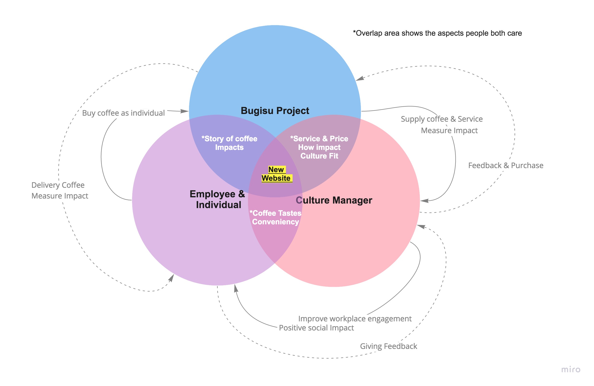
To start analyzing our data, I noted down everything of value that I heard from interviews, survey and noticed during observations. I group them and link each group to see their relationships. This process allows me to look at the overlay of the key pain points amount each party and I think it is also important to look at the relationship between Bugisu Project, Culture Manager and Employees, which help me identify the user needs.
Define Personas & User Journey
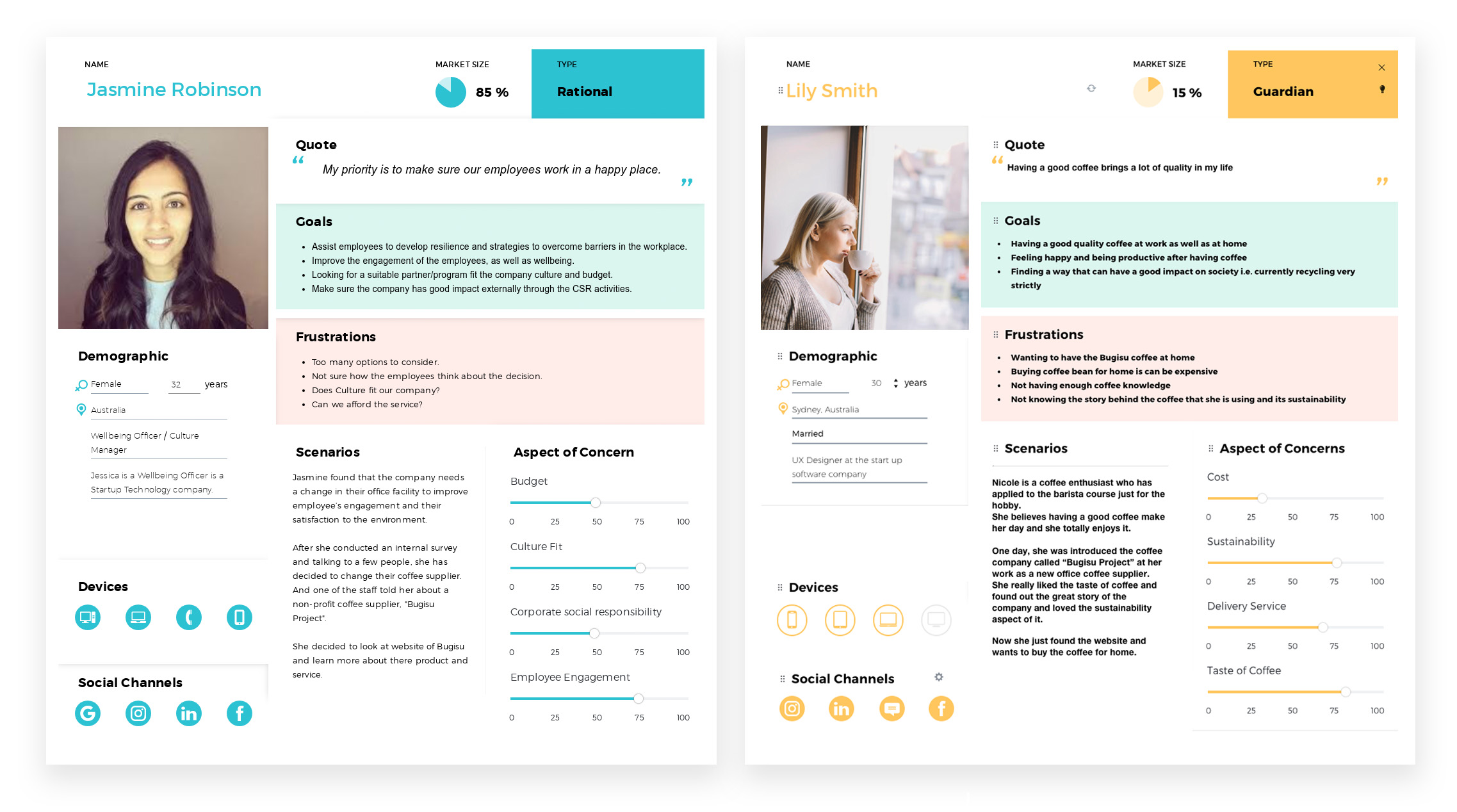
By creating personas, it helps me to understand a number of things about customers including their: goals, behaviours, frustrations and needs. And I use personas as my North Star when it comes to all my design decisions. So I always refer back to my persona and ask, “What design best services this person’s needs, if I ever encounter tough problems. And it helps me building empathy for users as well.
Solution Statement & Define MVP
By looking at the key pain point of our persona, we made the solution statement:
User needs a clear CTA to learn the story, products and service of Bugisu then feel confident enough to make the purchase.
To provide an intuitive design to solve a pain point, we created our MSCW chart to list and prioritize the features user need on the website.
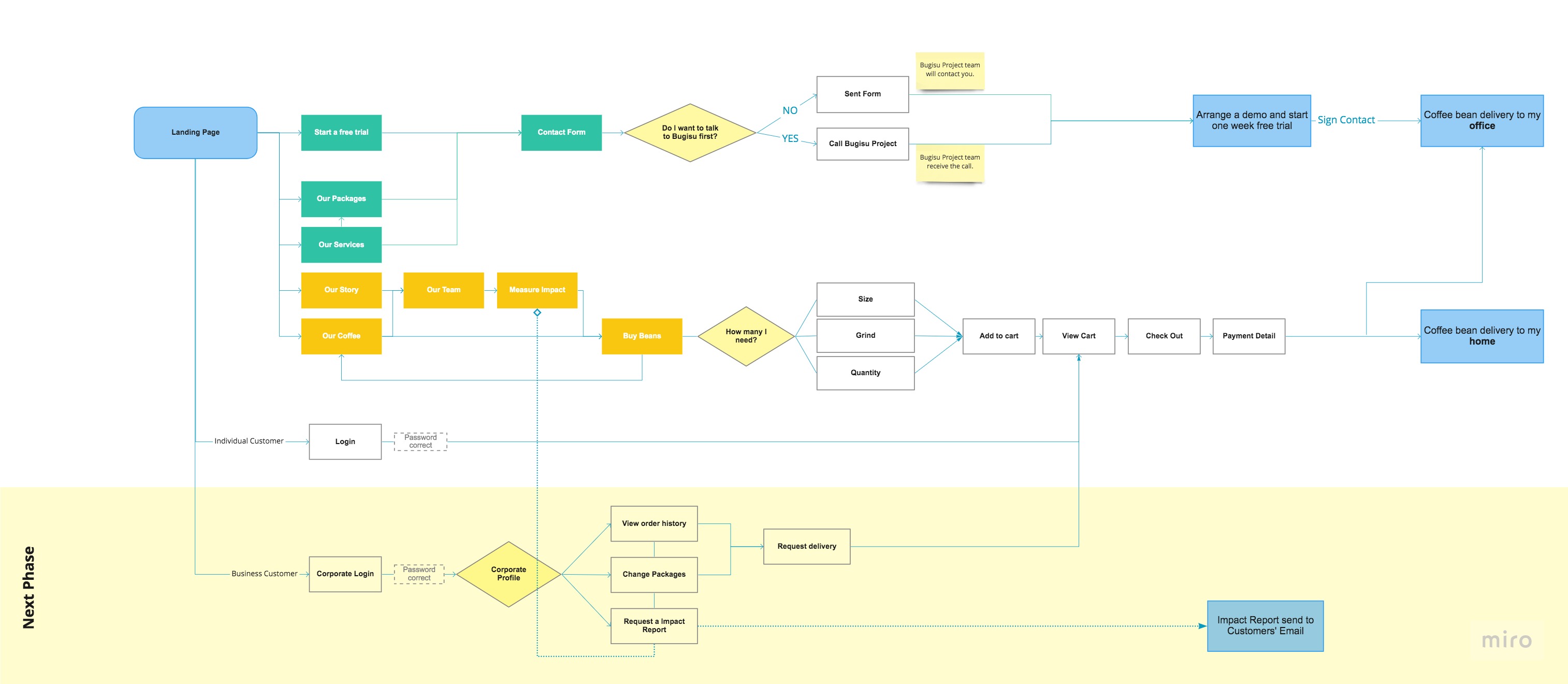
User Flow & Site Map
Design Development Highlight
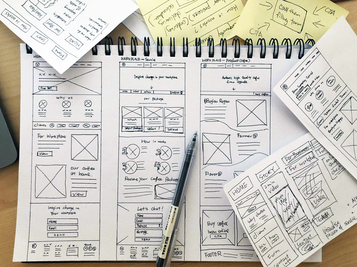
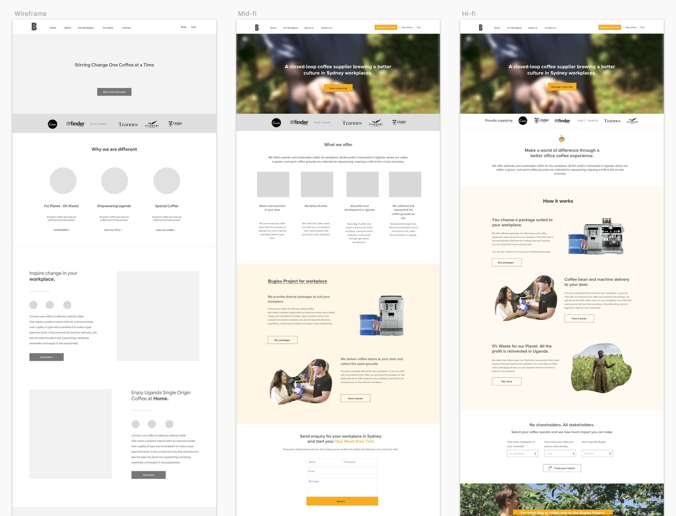
I always use pen and paper first, so I can easily experiment with different layouts and ideas and quickly share it with other people in the team. And then I use Sketch to digitalise the wireframe, clarify the design and also keep the mind open if there is any better design solution could solve users’ problem.
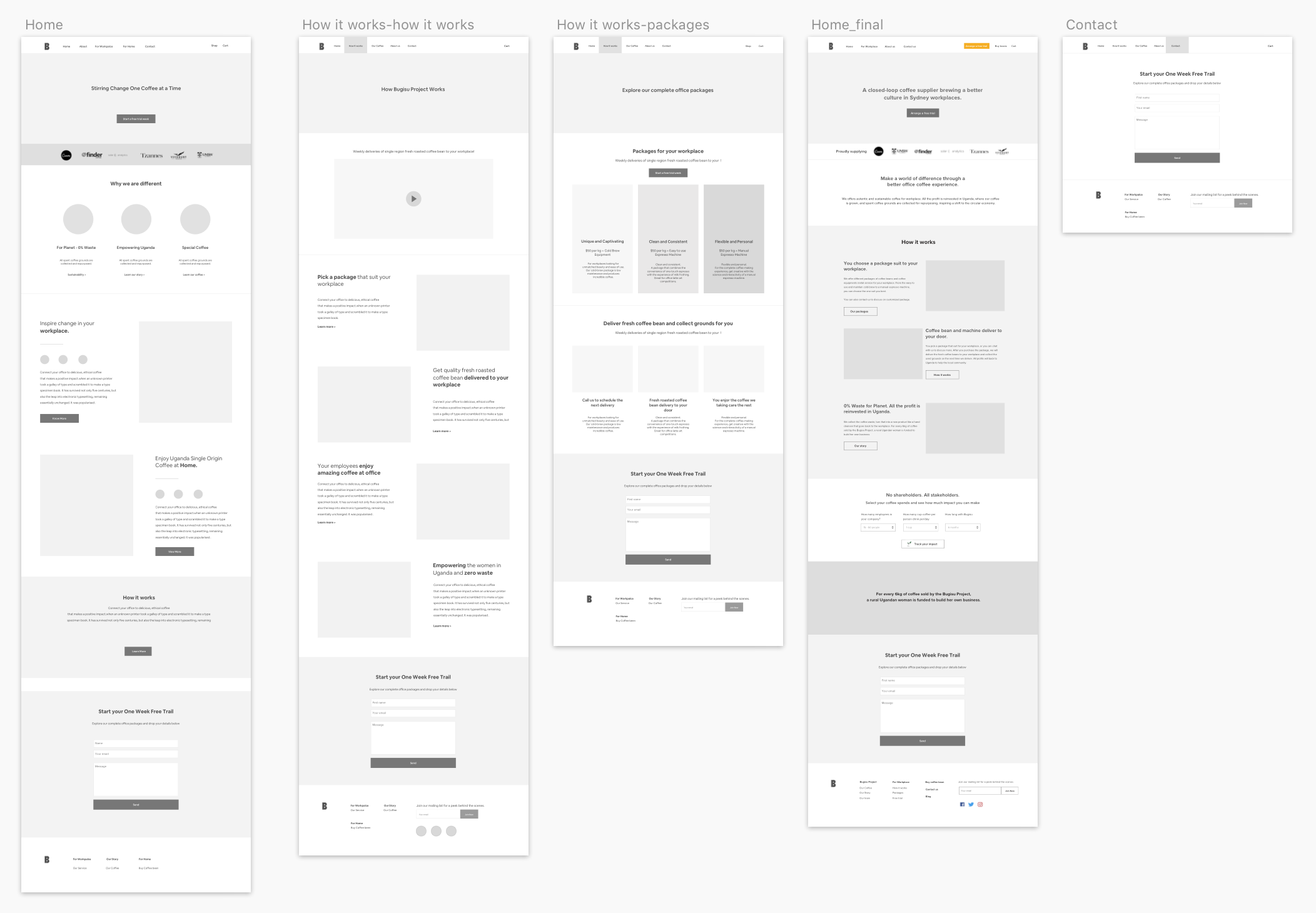
Home Page Iterations process:
Developments:
- Simplify the content. I developed the home page content layout by giving easier to follow visual assets and heading.
- Eye-catching CTA button on the sticky navigation.
- More context been giving on each section’s heading and images.
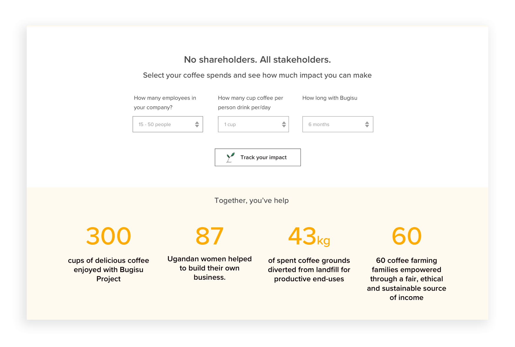
Impact Calculator:
I designed this impact calculator section on the home page, which allows the user to see their impacts with Bugisu Project by simply selecting their employee number, coffee spends and time period. It provides a much more engaging way for the user to understand their positive impacts.
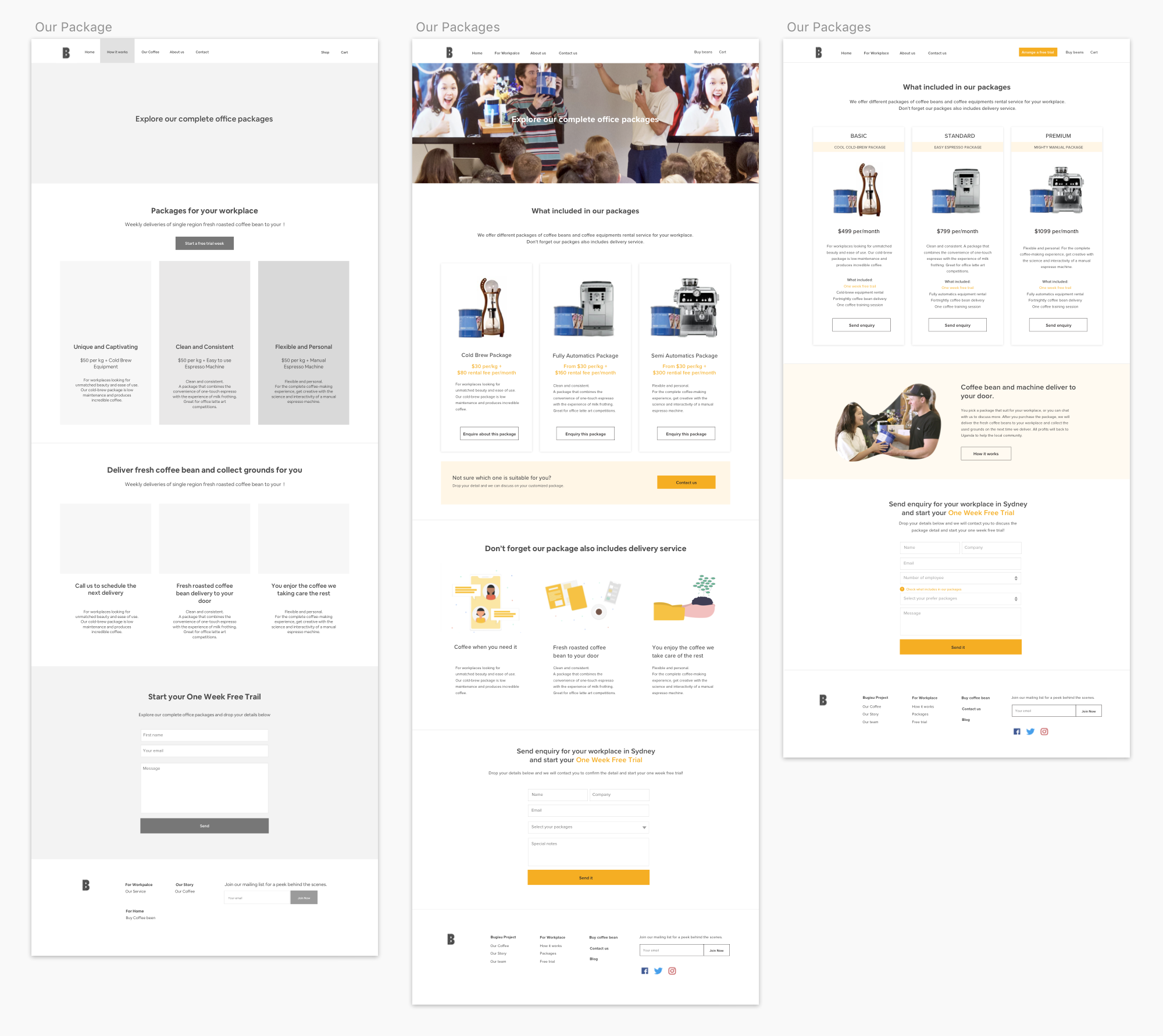
Our Packages Page Iterations:
Developments:
- Simplify the layout, removed the unnecessary content.
- Run Card sorting to finalise the navigation.
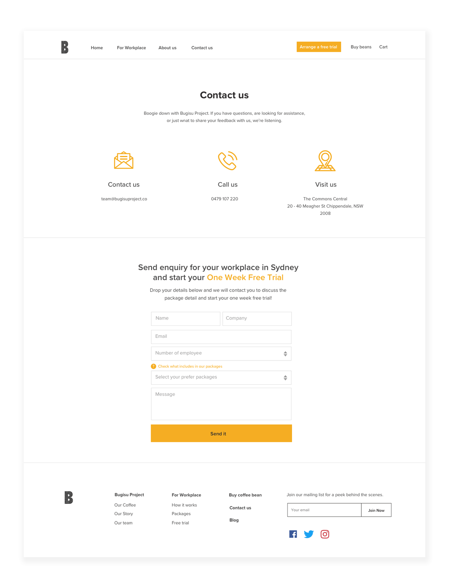
- User able to learn what is included in each package, and send enquiry for the preferred package.
- Be clearer that all packages come with delivery service, and user able to learn more if they want to.
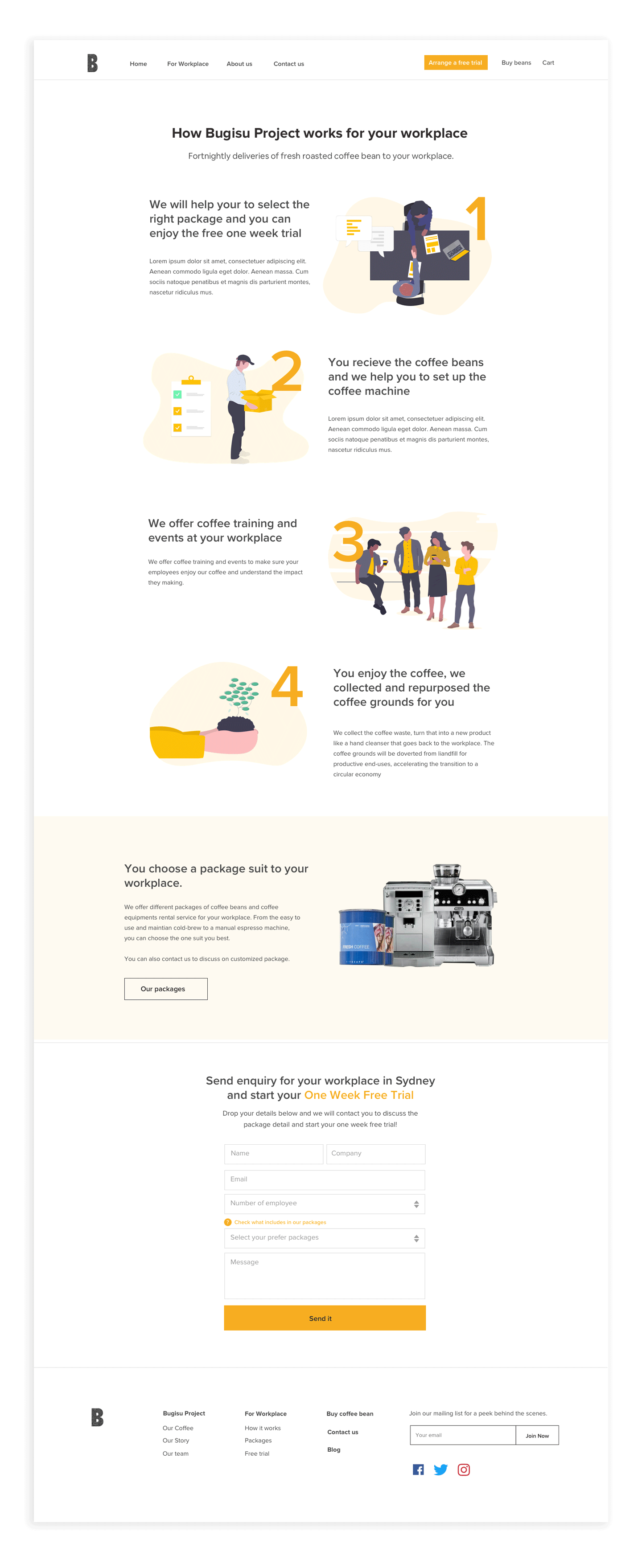
High Fidelity & Prototype
Next Steps
- A corporate login. Based on our research, our primary persona also has an issue to track their order and coffee spends. A corporate log in could be a good way to help users organise their purchase information with Bugisu Project.
-
Support or FAQ page could answer users questions immediately online.
-
More details on each package, which make Bugisu products arrangeable online.
What is happening to the Bugisu Project?
Bugisu Project changed its name to KUA ( https://www.withkua.co/home), I am excited to see they took some of my design to the new website!





No Comments
Comments are closed.